
A health insurance company is committed to helping millions of medical and specialty members achieve their best health. It works under three principles: to deliver easy and seamless customer experiences, help members achieve their best health through the five points of influence (primary care, social determinants of health, pharmacy health, home health, and behavioral health), and to gain power through integrated technology.
As of 2019, the company had a workforce of 46,000 employees, with a reported $64.9 billion in revenue. At the end of 2019, it entered a seven-year strategic partnership with Microsoft with the goal of leveraging technology to better serve their members.
Consolidating multiple systems into 1 cohesive platform
In 2018, the company began its digital journey, formalized by its Digital Health and Analytics vertical. After surveying the analytics professionals utilizing digital health and analytics data, it discovered that it had 47 disparate data sources and BI tools used throughout the company.
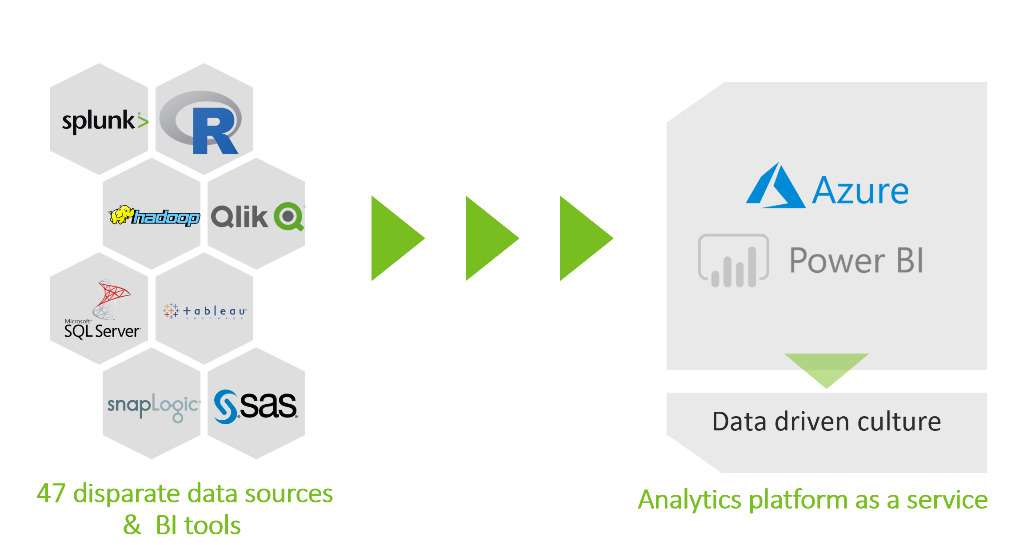
The company realized that having such siloed systems proved a challenge, so the Product Implementation team has worked to standardize data sets and reporting tools. It decided to condense its 47 disparate data sources and BI tools to a singular solution with Microsoft Power BI as its main BI tool.
Bringing data sources together
While the company has data to represent each individual customer, such as finances and clinical information, it stores each facet in a separate location. Because data is so isolated, it often takes users weeks, sometimes months, to track down specific information.
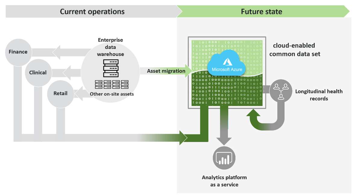
Currently, the Product Implementation team is working toward migrating all data to Microsoft Azure Data Lake Storage. This involves creating common data sets and gaining access through Azure Active Directory groups. With the transition, the company can eliminate the lack of cohesion among data sources and tools and utilize the capabilities of Power BI and Azure to create an overall more efficient platform.
Gaining deeper insights into costumer health using Power BI
Social determinants of health are the conditions in the environments in which people live, learn, work, play, worship, and age that affect a wide range of health functioning and quality-of-life outcomes and risks. The Associate Vice President of Population Health Strategy at the company works with his team to drive a large emphasis on these social determinants of health in addition to health-related social needs. Under the leadership of a Senior BI Engineer, the company has used Power BI to create reports to help track how social determinants and health-related social needs affect their individual customers.
The big challenge in creating this Power BI report was taking survey data relating to social determinants of health from multiple vendors and combining it together with the goal of telling a cohesive story.
The company wanted to represent all the data in one place, rather than looking at individual data in their respective silos. The Power BI engineering team merged all the disparate consumer data sources into a single master table that was then stored in the data warehouse environment. This information could then be accessed through a simple open database connection.
However, after merging all the data into a table, another problem emerged. The table needed to be formatted in a way for Power BI to effectively consume it. Originally, some of the visuals were taking 45–60 seconds to load. One of the main approaches to optimizing the load time was with Power Query. With the use of Power Query, the company quickly consolidated its high volume of data into a handful of columns and reduced visual load time tremendously.
As tracking social health determinants becomes a bigger part of Humana’s overall goals, it collects more data. Because of the quick influx of data, it was crucial that the company find a way to collect, standardize, and aggregate data in a seamless manner to create the necessary visualization—and Power BI offered that capability.
Tremendous amounts of collaboration took place between the Power BI engineering team and the Population Health Strategy team to ensure the final dashboard for this initiative met user expectations and utilized data as much as possible. These joint efforts were all accomplished during the mandated stay-at-home order. The seamless collaboration with Power BI allows new versions of the dashboard to be rolled out in as little as a few days.
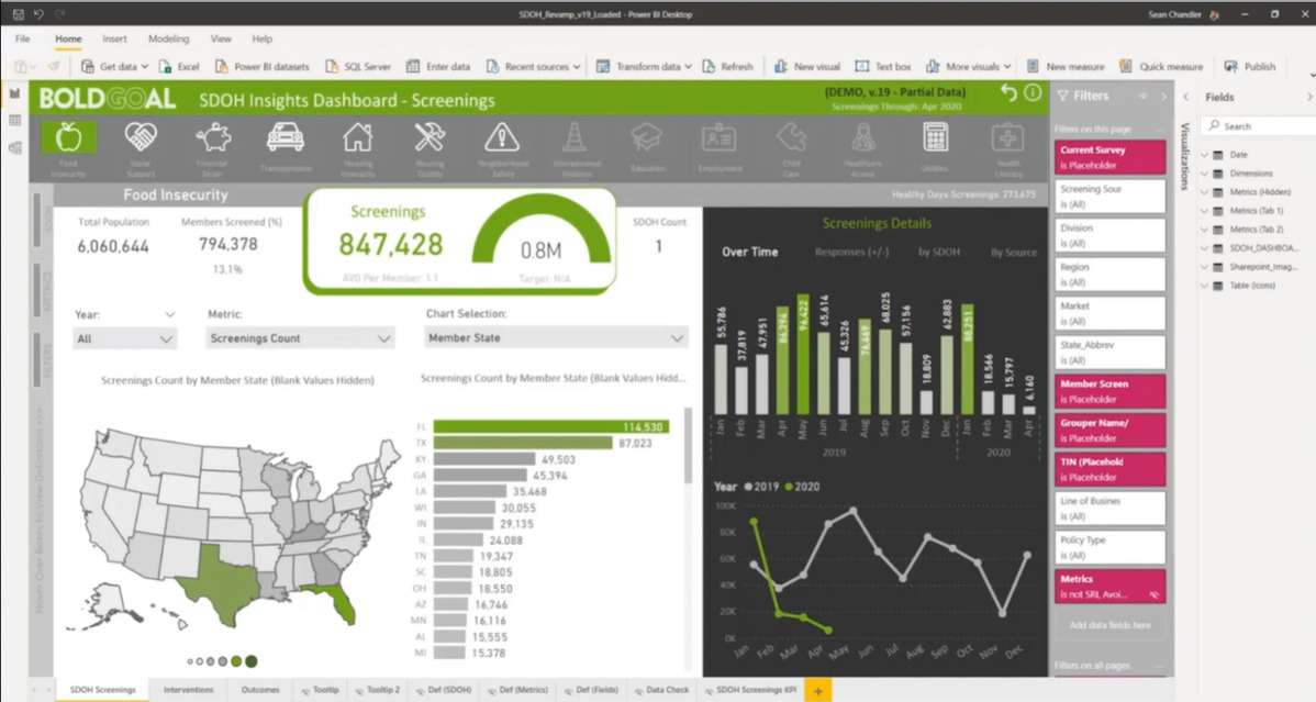
Since many of the consumers accessing this tool were first-time Power BI users, the team wanted to make it as easy to use as possible. A big priority was ensuring that users could seamlessly isolate and highlight certain parts of the data. This was achieved using the Chiclet Slicer for Power BI. Using the Chiclet Slicer, a series of icons were placed at the top of the report to highlight different areas, giving users an intuitive way to immediately filter to specific fields or domains. In the past, it had been difficult for the company to quickly pinpoint data, but the simple and intuitive filtering in Power BI has made this task simple.
In order to standardize the different views and dimensions featured in the report, the Power BI engineering team took time to carefully curate a list of filters for the report’s filter pane. The team wanted users to have a simple way to filter by category such as market, region, and division.
To take things a step further, a summary table was created that contains the different values within the respective dimensions and puts them into their own table that can then be connected back to the source data set. This allows users the opportunity to have quick and customizable visualizations at their fingertips. This feature is especially important considering the range of end users, scopes, and perspectives the tool caters to and the diverse needs of each user.
The bookmark feature within Power BI has also been very impactful for the company’s reports. With bookmarks, users can toggle between commonly visited views regarding screening details. The changes, based on the selected bookmark, are also reflected within the other visualizations on the dashboard.
The Power BI tooltips feature has been a great resource for users to break down screening information by geography or by state. By integrating the Shape Map visual with tooltips, the Power BI engineering team was able to develop a specific visual for each individual state. Because of this feature, users have an easy way to access state-specific information, rather than spending time toggling through filters and bookmarks. These specific visualizations also give business leaders an executive summary where they can immediately see key metrics for the geographical locations they are responsible for.
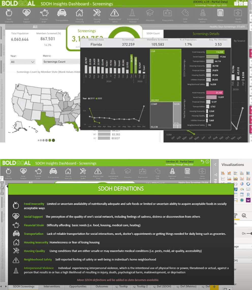
Another valuable aspect of the company’s report is the use of the Tree Map visual. When a user hovers over the gray lines on the left side they see the definitions of each social determinant of health and metric visualized in the report. Users can also filter and field definitions. This capability brings more clarity about the underlying data in the report and ensures users utilize the information to the fullest extent.
Driving user adoption
A big part of the company’s Power BI journey has been getting users to adopt the tool and newly created reports. In the beginning, getting executive sponsorship and alignment was crucial. Executives needed to see and understand the effectiveness of Power BI and the potential that the tool has to transform their business.
Education and communication were important adoption drivers, especially with the wide variety of tools used prior to Power BI. In the beginning stages of its Power BI journey, the company spent a good amount of time showing users that Power BI was an all-encompassing tool, meeting all their BI needs. Implementing effective education and training simplified the transition from other tools. Creating common measurement criteria, like monthly active users, was critical for the company in helping to set goals and stay on track with Power BI adoption.
A rapid response to COVID-19
With COVID-19 coming on so rapidly, the company needed to understand a large amount of data in a short amount of time. Information such as testing availability, antibody testing, and resources for positive-testing members was crucial for key decisions it needed to make. Having access to Power BI tools, even with everyone working from home, to quickly visualize all this information in real time has been critical for the company to form and execute appropriate strategies.
While COVID-19 couldn’t have been anticipated, Power BI allowed the company to create reports and dashboards, form insights, and derive strategy quickly and effortlessly. With everything happening at such a rapid pace, Dr. Renda explains that “The company needed to understand new data and make some key decisions about how to respond. Having access to Power BI tools to very quickly build dashboards to visualize all that information and update it in real time was absolutely critical to both forming our strategy and executing on it.” With Power BI, the company adapted on the fly and continues to collaborate even as everyone works from home, a critical capability now.
Since the beginning of COVID-19, the company’s team has seen monthly active users increase by 97 percent, and new apps and reports increased by 37 percent. Yet only 55 percent of the new monthly active users contribute to COVID-19–related dashboards, showing that users are adopting Power BI in all aspects of business.
Users are seeing how quickly the company used Power BI to stand up in a crisis and realizing the resource the tool can also provide in their everyday workloads. Hooper says, “When users see the COVID response, they begin to think, ‘If we can do that in a time of crisis, how can I move past the crisis mode and use Power BI and Microsoft Power Platform in my daily operations?’” the company’s use of Power BI during COVID-19 has empowered users to fully embrace the platform as they’ve seen the benefits of using it while in remote locations.
Creating citizen data scientists
With Power BI, the company aims to derive actionable insights and make key business decisions. In the future, it is focused on using Power BI to create more citizen data scientists and cultivate a data-driven culture to help members achieve their best health.
When users see the COVID response, they begin to think, ‘If we can do that in a time of crisis, how can I move past the crisis mode and use Power BI and Microsoft Power Platform in my daily operations?’
Product Implementation Team Lead
